Design update for KEKS Pay mobile app

Design evolution
For many years, we have been continuously working on the design evolution of the KEKS Pay application, with ongoing improvements and adaptations focused on creating a smoother and more intuitive user experience. This latest update is just one in a series of continuous refinements.
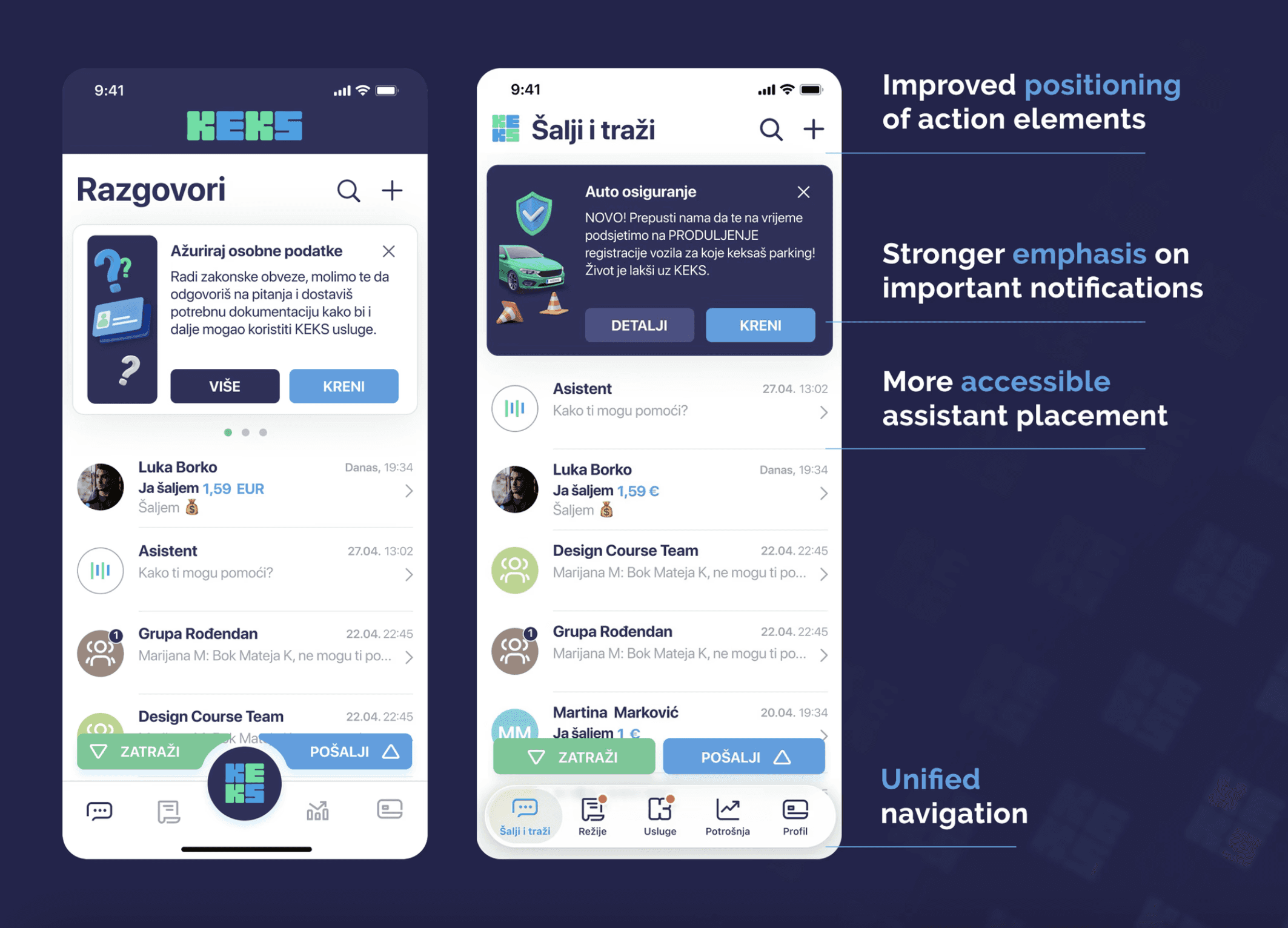
Apple iOS Design Standards
By following the latest Apple iOS design standards and listening to feedback from long-term KEKS Pay users, we redesigned the navigation bar into a more standardized and familiar structure in order to improve usability and navigation clarity.
The updated navigation experience was designed to feel more intuitive and aligned with interaction patterns users already use on a daily basis, creating a smoother and more natural flow throughout the app.
The new KEKS Pay update also included adapting the interface to the latest Apple Glass-inspired visual direction, while keeping the experience visually synchronized across Android devices as well.
Additional UI elements such as tabs, navigation flows, and important notification areas were further refined to create a cleaner, more consistent, and visually balanced experience.
Conclusion
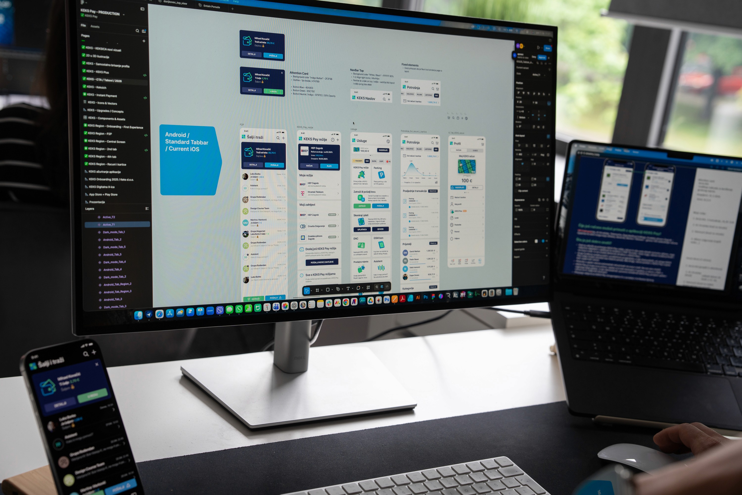
Good UX is often not about making something look different, but about making it feel natural, intuitive, and effortless to use.
With this latest KEKS Pay update, our goal was not only to modernize the visual appearance of the application, but also to improve the overall user journey through more familiar navigation patterns, refined interface elements, and interactive onboarding experiences.
By combining user feedback and modern iOS design principles we created a more polished and engaging digital experience that helps users navigate the app with greater clarity and confidence.
As digital products continue to evolve, we believe that continuous refinement, attention to detail, and user-centered design remain essential for creating products people genuinely enjoy using.


All rights reserved. Copyright© 2009 – 2025 Mihael.net.
Scientia Studio ltd. / d.o.o. VAT Number: HR14421758437