The Hidden Cost of Inconsistent Visual Communication

A brand is rarely experienced through only one format. People may first encounter it through an ad, later visit the website, watch a video, see a billboard, open a presentation, or interact with the product itself.
Each of these touchpoints may look good individually, but a problem appears when they do not feel connected. Different typography, illustration styles, animation, tone, and messaging can make a brand feel fragmented and less trustworthy.
Visual inconsistency does not always look like bad design. Sometimes, it looks like several good designs that simply do not belong together.
Why Consistency Matters
Most people will not consciously analyze whether a brand uses the same composition, imagery, motion, or visual hierarchy across different formats. They will simply feel that something is off.
Consistency creates familiarity. It helps people recognize the brand, understand what it represents, and trust that each new interaction belongs to the same experience.
This does not mean every piece of communication should look identical. A billboard, video, interface, and social media post all have different roles. The goal is to keep a recognizable visual logic while adapting the idea to each format.
KEKS Pay: Extending Brand Personality

KEKS Pay is a good example of a brand with a clear and recognizable personality. Its visual tone cannot exist only in isolated campaign materials. It also needs to continue through the interface, navigation, illustrations, communication, and product interactions.
When creating new elements for a brand like KEKS Pay, the goal is not only to make something visually attractive. Every new component should feel like a natural extension of the existing experience.
The simplicity, humor, accessibility, and visual personality must remain recognizable even when the format or purpose changes. A strong visual system allows the brand to evolve without losing its identity.
Rebuy Stars: One Story Across Multiple Formats
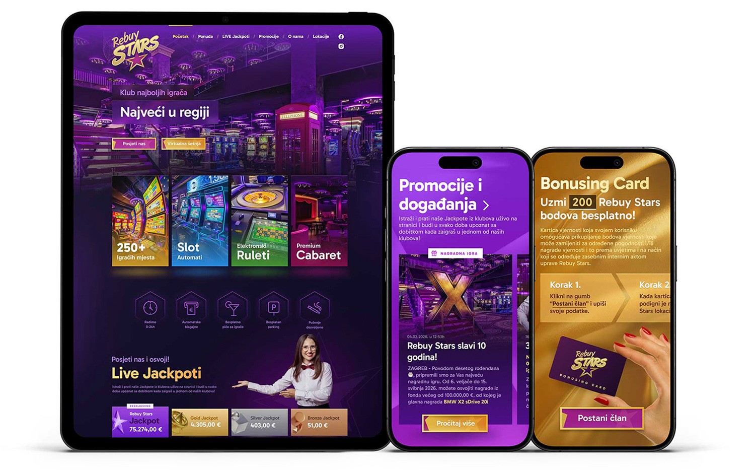
Campaign concepts often need to move between billboards, videos, animations, digital advertising, social media, and physical environments.
Each format communicates differently. A billboard has only a few seconds to attract attention, while a video can gradually develop a narrative. Social media content must work on a small screen, while animation introduces movement, timing, and sound.
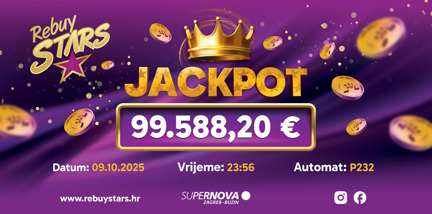
The Rebuy Stars work demonstrates why it is important to think beyond a single deliverable. The goal is not to copy one layout into every format, but to translate the same central idea into the language of each medium.
When this translation is successful, the audience recognizes the campaign wherever they encounter it. The format changes, but the story and visual identity remain connected.
Super Casino: Creating a Recognizable Visual World
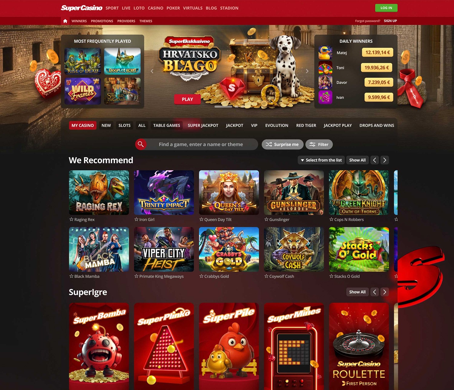
Gaming and casino brands often operate within visually rich environments filled with characters, effects, animations, campaigns, and interface elements. Without clear direction, this variety can quickly become chaotic.
The Super Casino projects show how consistency can exist even within highly expressive communication. A campaign can feel dynamic, entertaining, and visually intense while still belonging to the broader brand.
Illustration style, typography, visual effects, color behavior, and motion all contribute to the impression that the content exists within the same recognizable world.
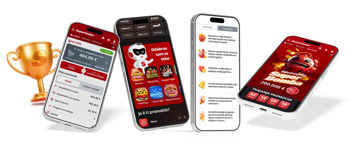
This becomes especially important when a brand produces a large volume of content. Without a system, every new asset adds more noise. With a system, every new asset strengthens recognition.
One Creative Idea, Many Applications
The strongest creative ideas are not limited to one visual. They can expand into websites, videos, presentations, social media posts, digital ads, event screens, billboards, and interactive experiences without losing their identity.
That requires thinking beyond individual deliverables from the beginning. Instead of designing one asset and adapting it later, the creative team should consider how the idea will behave across different screens, formats, and environments.
A consistent visual system makes this process easier. It gives teams a shared direction for typography, illustration, imagery, motion, composition, and tone while still leaving enough space for creativity.
It also makes production more efficient. New materials do not need to start from zero, and different teams are less likely to pull the brand in unrelated directions.
Consistency Is a Business Advantage
Visual consistency is not only an aesthetic preference. It affects how quickly people recognize a company, how clearly they understand it, and how much confidence they place in it.
A consistent brand appears more intentional and mature. Its marketing works better because each touchpoint supports the next one. Its content is easier to produce because the visual direction does not need to be reinvented for every project.
At Mihael, we connect design, illustration, animation, video, and interactive experiences into one coherent visual language. The strongest communication is not created through isolated assets, but through a system in which every part feels like it belongs to the same story.


All rights reserved. Copyright© 2009 – 2025 Mihael.net.
Scientia Studio ltd. / d.o.o. VAT Number: HR14421758437