


A Logo That Speaks the Language of Movement
The Tracey logo embodies dynamism and movement. The stylized “T,” with its flowing horizontal lines, creates a sense of speed and progress, symbolizing real-time tracking and continuous results flow. This motion effect resembles a trail of action, highlighting themes of competition, agility, and advancement.
Combined with clean, bold typography, the logo conveys modernity and energy, reflecting Tracey’s role as a tool that delivers speed, precision, and innovative event tracking.


the Colors of the brand
The Tracey palette blends energy and reliability. Bold red conveys speed and dynamism, while dark blue adds trust and precision. Soft gray tones and a light background ensure clarity and balance, creating a brand identity that feels both fast-moving and dependable.
Typography
Open Sans is a clean and modern sans-serif typeface designed for readability across digital interfaces. Its balanced shapes and versatile style make it ideal for creating a clear, approachable, and professional look in the Tracey brand.


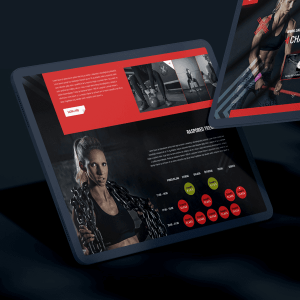
Web design delivered for a crossfit personal trainer, focused on clear presentation, strong branding, and a motivating user experience that converts visitors into clients.

For this project, we delivered a full brand build, UI and UX design, mobile and web app design, watch and tvOS app design, as well as video ads and social assets end-to-end.

UX and UI design, along with a complete tablet app design, delivered as a sales and advisory tool. The experience enables fast, visual, and structured presentation of vehicles and features.

Branding, UI and UX design, along with mobile game and interface design delivered for a puzzle game experience.
The game uses simple mechanics that are easy to learn and hard to master.

All rights reserved. Copyright© 2009 – 2025 Mihael.net.
Scientia Studio ltd. / d.o.o. VAT Number: HR14421758437